
Building a parking platform’s first design system, and getting a skeptical team to bet on it
Role
Team
Timeline
Scope
Impact overview
Minutes
for a global style change, now a single token edit
Hours
from deciding on a small change to shipping it
3 years
as the foundation engineering builds on every day
No system, no consistency, no way to change anything
The parking platform’s operations portal had never had a design system. Every new feature’s components were built from scratch. Buttons, modals, and headings looked different depending on which screen you landed on. Nobody chose that. Nothing was tying them together.
For a while, the portal was built by an overseas team with no in house design or product presence guiding day to day decisions. Without a shared source of truth, they made their own call on everything, from what a button should look like to how a modal should behave and what counted as an error state. Each decision was reasonable on its own. Together, they added up to a product that couldn’t be changed consistently, because nothing was built the same way twice.
When the portal revamp kicked off, this became impossible to work around. Every screen was being rebuilt anyway, which made it the right moment to fix the foundation as well as the surface.
Getting the go ahead
The first hurdle was convincing people the system was worth building at all.
Stakeholders pushed back early. The team was small, the portal rebuild was already a big lift, and a design system felt like extra scope with no immediate payoff. I walked them through the long term cost of rebuilding every component from scratch against investing upfront, and got approval for the time to build the system alongside the portal, not after it.
That first approval was the only one it needed. I was the only designer on the team, so from then on the system grew with the portal as I designed it.
The argument came down to compounding cost. A one-off component was cheap to build once and expensive forever after, since any future change to that pattern meant redoing the work screen by screen. A token driven system paid that cost once, upfront, so a change could ripple everywhere it was needed instead of being rebuilt each time.
Building it from the ground up
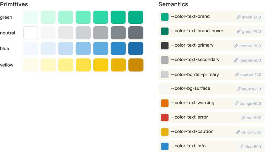
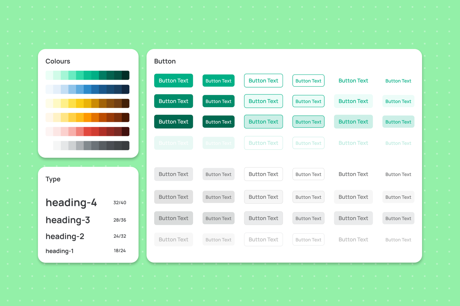
Since every screen in the portal was being redone anyway, I started fresh instead of trying to reverse engineer consistency out of the old product. I used shadcn as the base, since engineering already wanted to go that direction, and built it out as an atomic system.
The rollout was gradual. Four engineers built the coded components alongside the portal redesign, creating each one as it came into use in the design file.
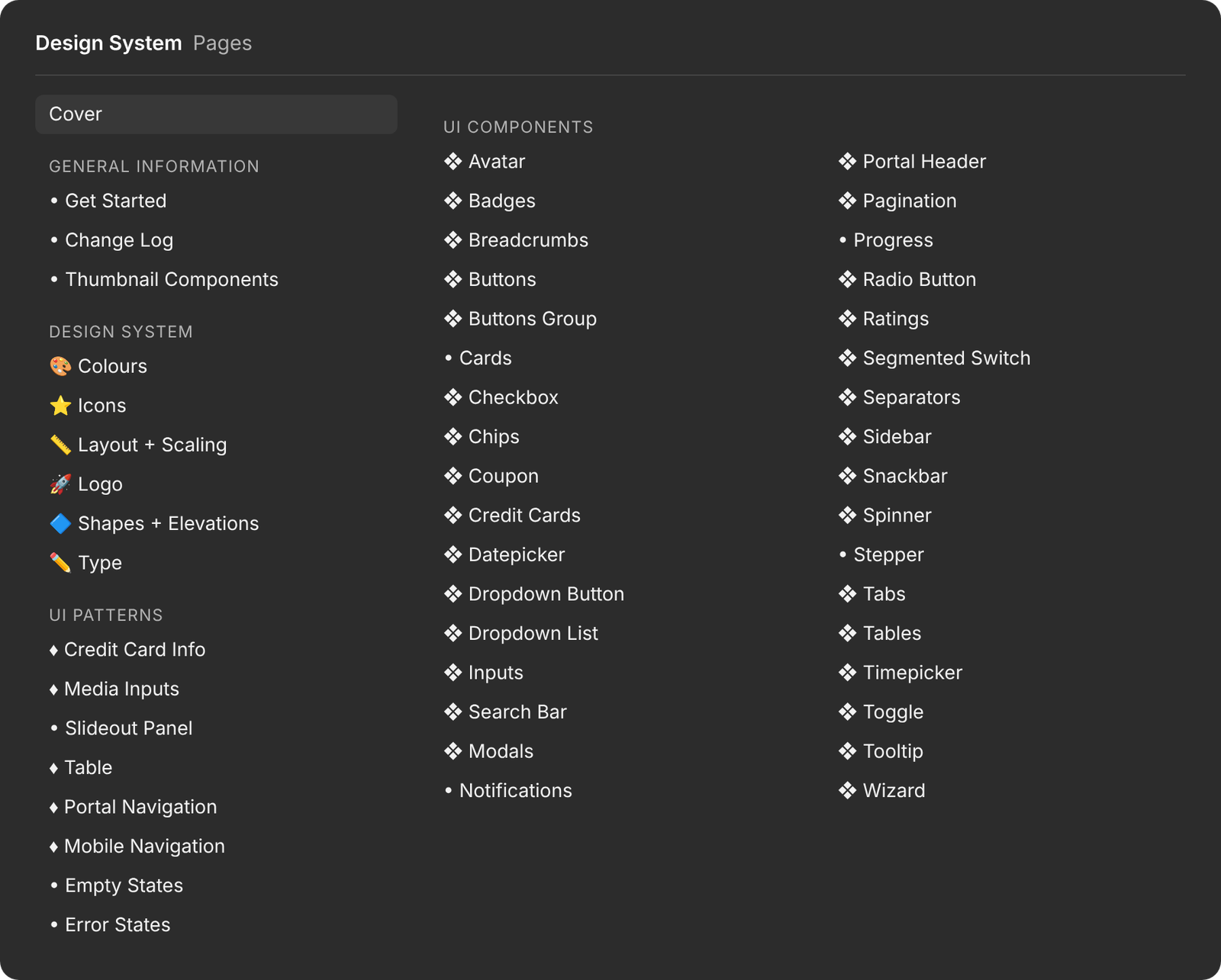
The system ended up covering:
- Color tokens, both primitive and semantic
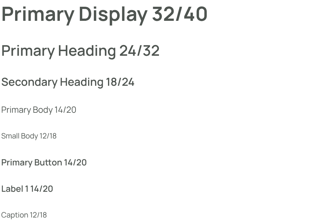
- A strict type scale with its own tokens
- Spacing, shadows, and elevation
- Shape, border, and radii tokens
- An icon library built on Material UI icons
- A full component library, including semantic states, variables, and animations
- A file organization and dev handoff structure
Two parts of this mattered more than the rest.
Spotlight: rebuilding the dev handoff
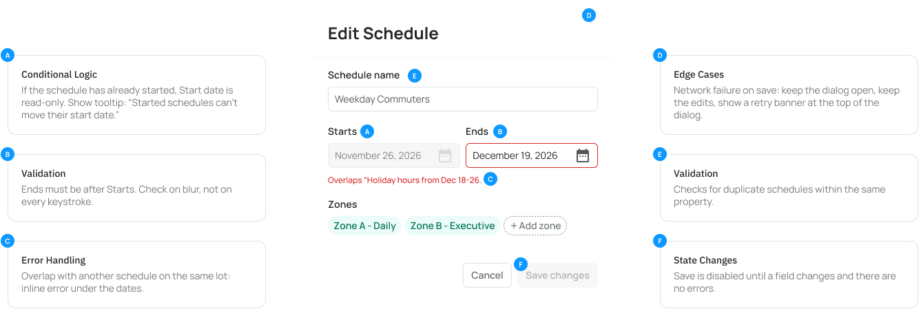
Before the system existed, handoff was a guessing game. Files rarely covered every state or edge case, so engineers filled in the gaps themselves, and often filled them in wrong.
I sat down with the dev team and asked where things kept going sideways. The answers were consistent. Too much was left open to interpretation, and by the time a feature shipped, decisions had been made by whoever happened to be building it.
I rebuilt the handoff structure so every flow was fully specified, not only the happy path. Conditional logic, state changes, and error handling all lived in the file as annotations, so nothing was left for a dev to guess.
Spotlight: the component library as a shortcut
Once the component library existed, small changes stopped requiring a full design cycle.
Before, even a minor update meant building an entire feature file and walking a dev through it in a handoff meeting. After, most small changes needed only a short conversation and a written note pointing to the right components. That cut days out of the gap between deciding on a change and shipping it.
Designing got faster too. A side panel or a data table used to mean drawing every cell and input by hand. With the library, I placed the table and panel components and changed their settings and content.
Style level changes moved even faster. A global update that used to mean rebuilding components one at a time became a single token change, taking hours of rework down to minutes.
The outcome
The system did what the early pushback said it wouldn’t. It let a small team keep pace with a full portal rebuild without design or engineering becoming the bottleneck.
- It solved the resourcing problem stakeholders were worried about. One designer and four engineers kept up with a full portal rebuild, because the system took on the repetitive work that used to fall on each of them.
- Handoff stopped being a source of rework. With every state and edge case spelled out in the file, the guesswork that used to lead to wrong implementations mostly disappeared.
- Three years later, it’s still in use. The stakeholders who questioned the investment didn’t come from a design or product background, so the value wasn’t obvious to them at the time. The engineering team builds on it every day, which is the clearest evidence the early bet was right.
What I’d do differently
The thing I’d change is how I made the case for the system. The early pushback came from not being able to show the cost of having no system in numbers that meant something outside of design. I won the argument through the long term case, but next time I’d track things like component rebuild time from the start, so the value was visible on a dashboard instead of something I had to argue for.
Let’s solve the right
problem together.