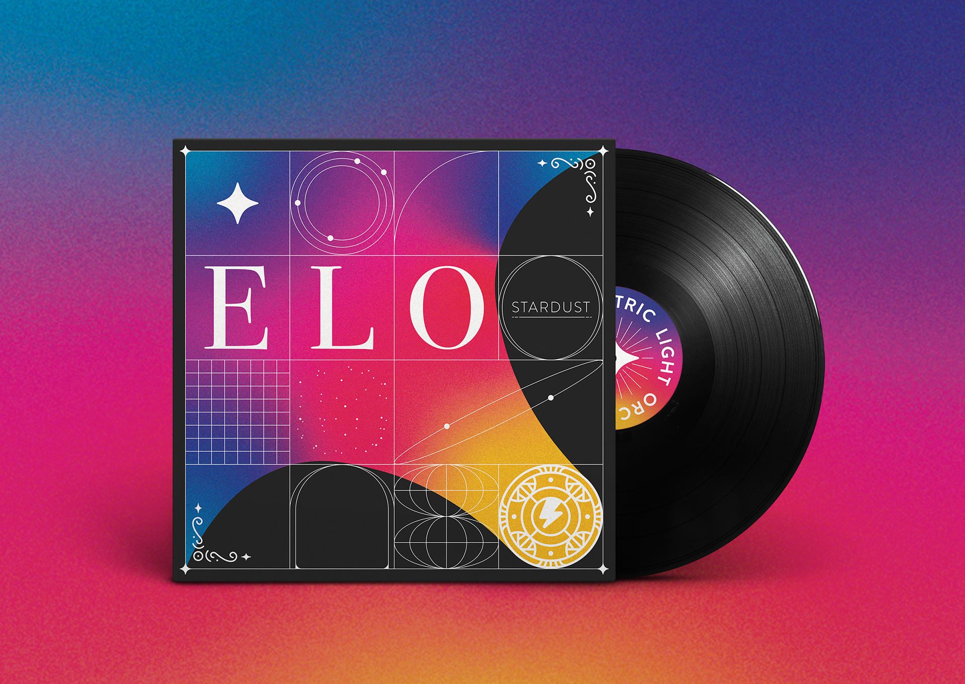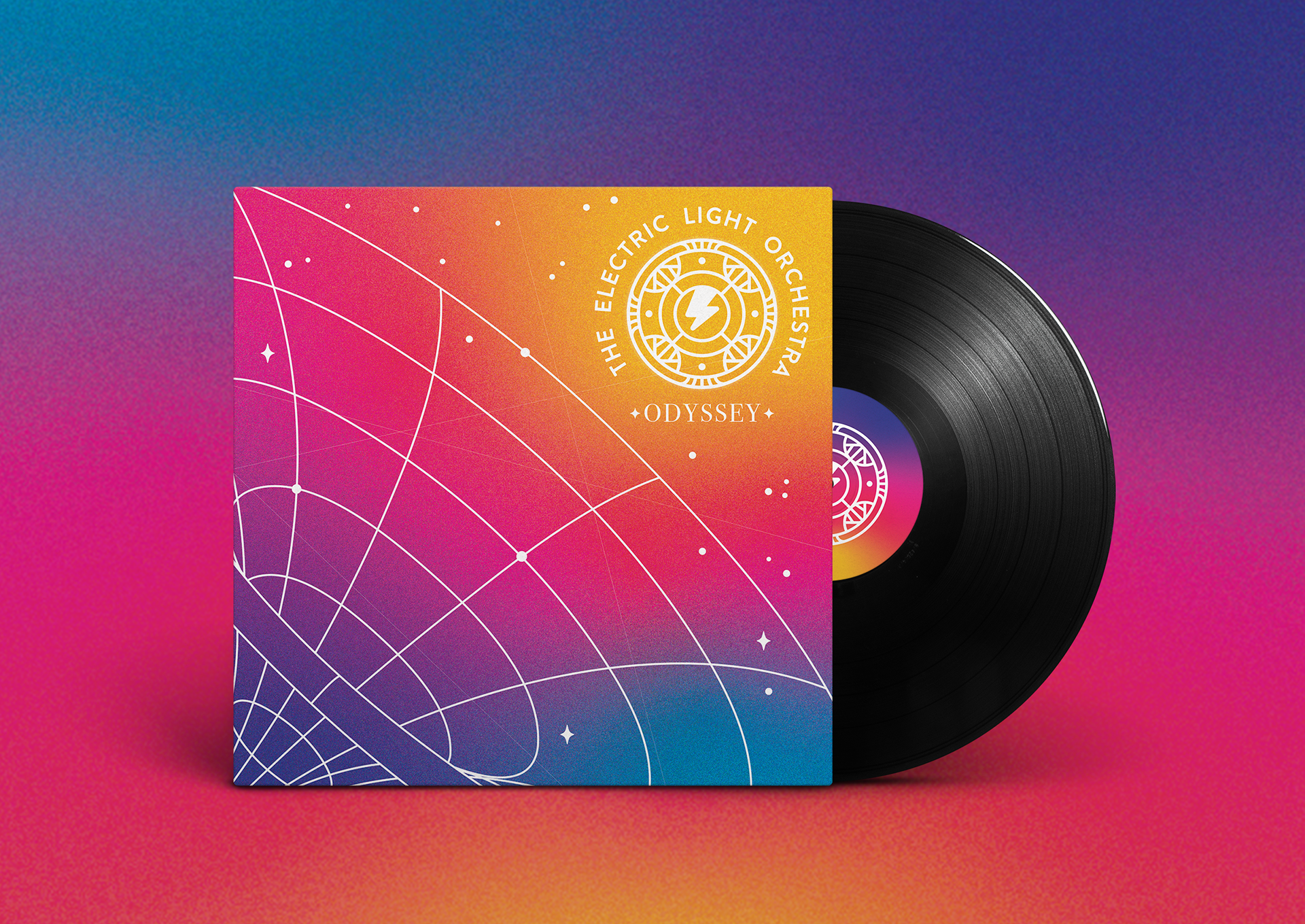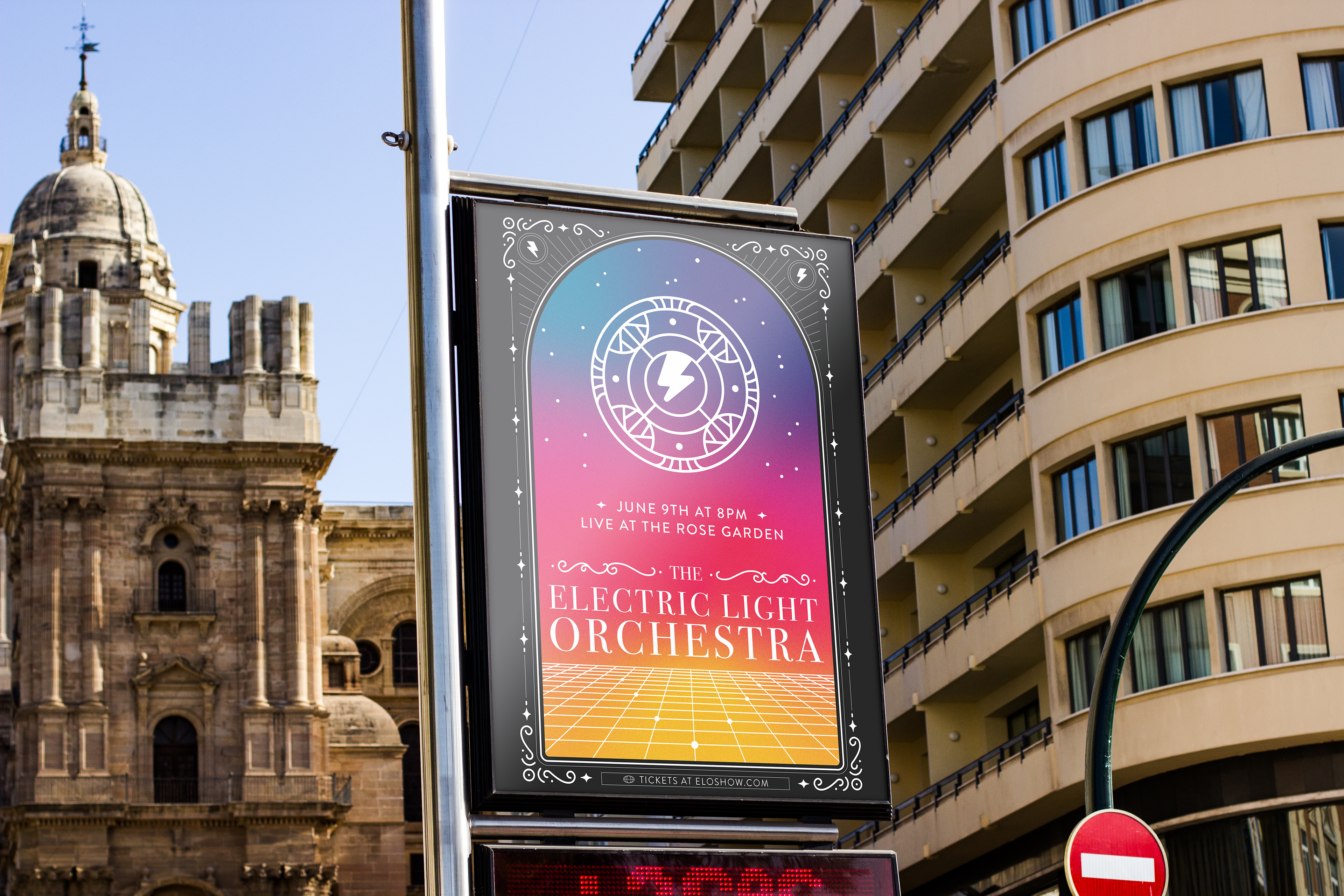
I’ve been a huge fan of the band Electric Light Orchestra for years. Recently, I noticed that they have barely any official merchandise; just a few shirts and their album covers. Their brand is also mostly limited to various (excellently done) renditions of their frisbee-spaceship logo and not much else. Many of the people my age who I have asked around campus seem to not be familiar with ELO. This project is a re-imagining of the band's brand with the intention of bringing it back into the spotlight.
The objectives of this project were to:
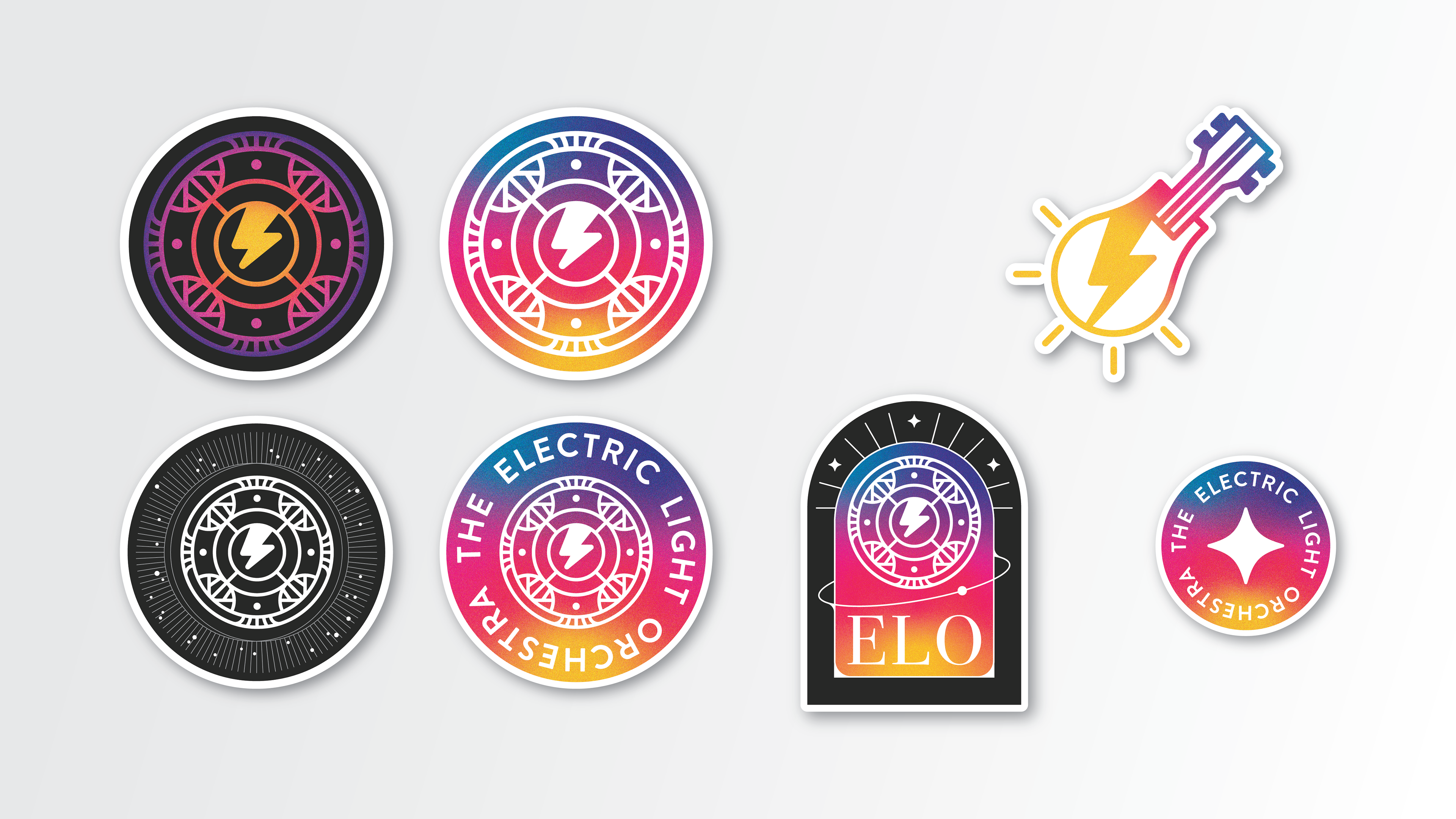
Update the brand to feel more cohesive and relevant.
Keep key elements of ELO’s current branding to ensure it is still recognizable.
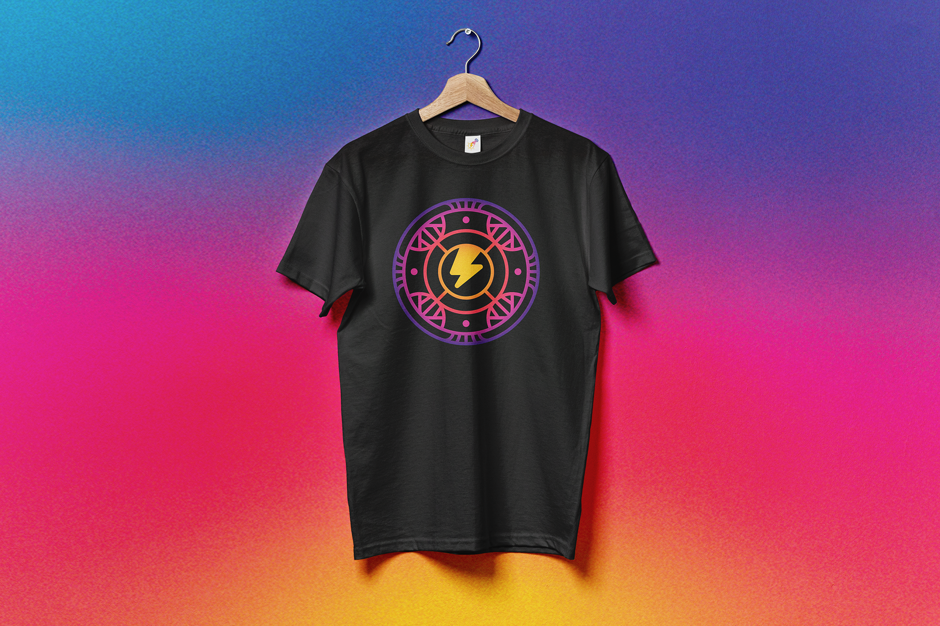
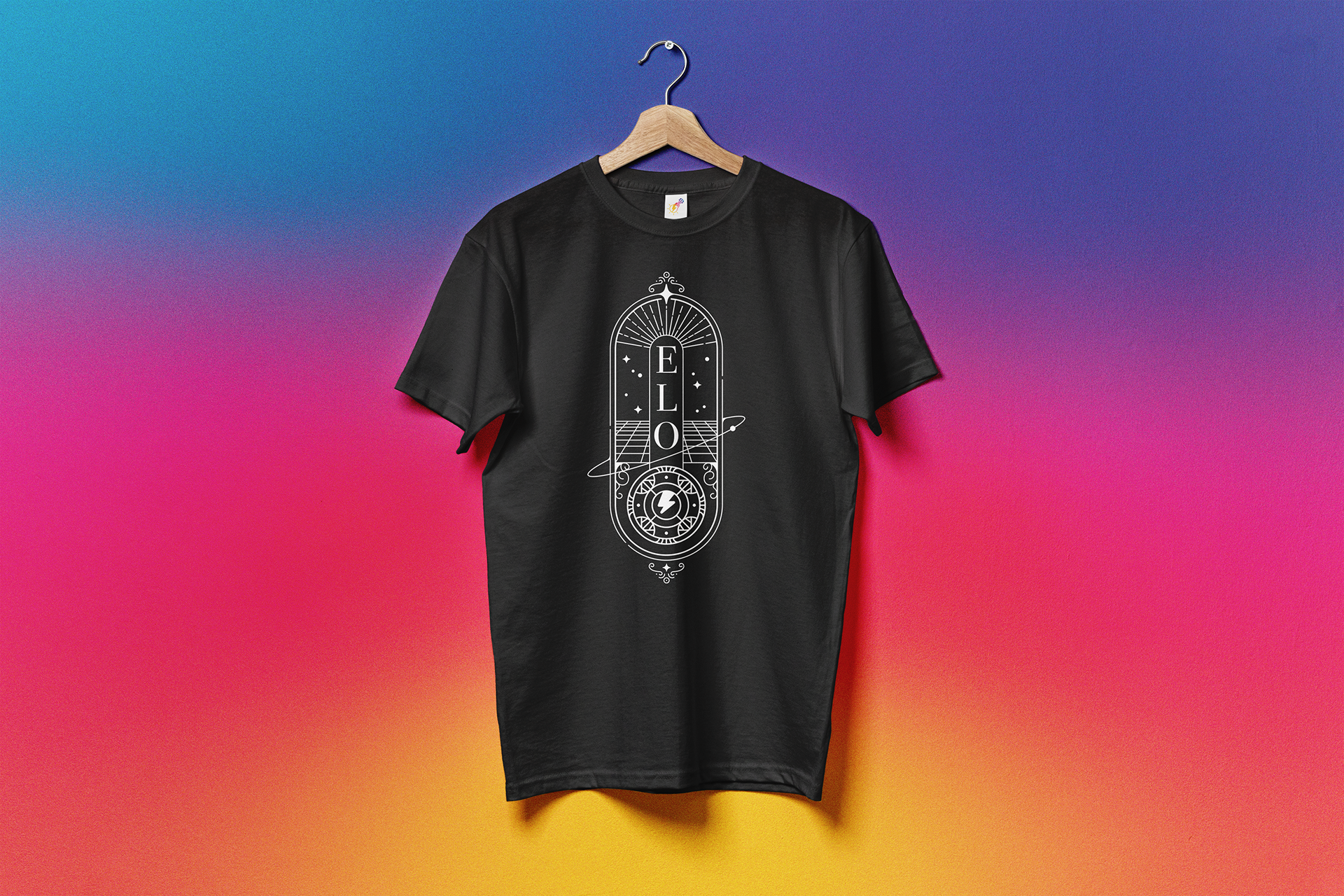
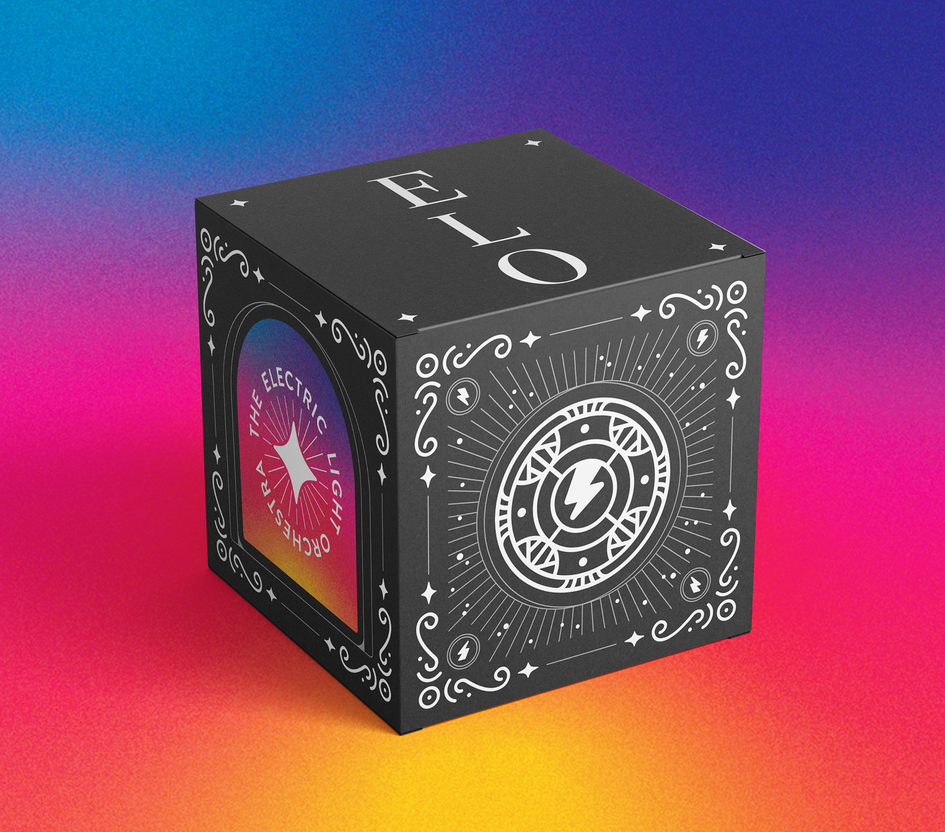
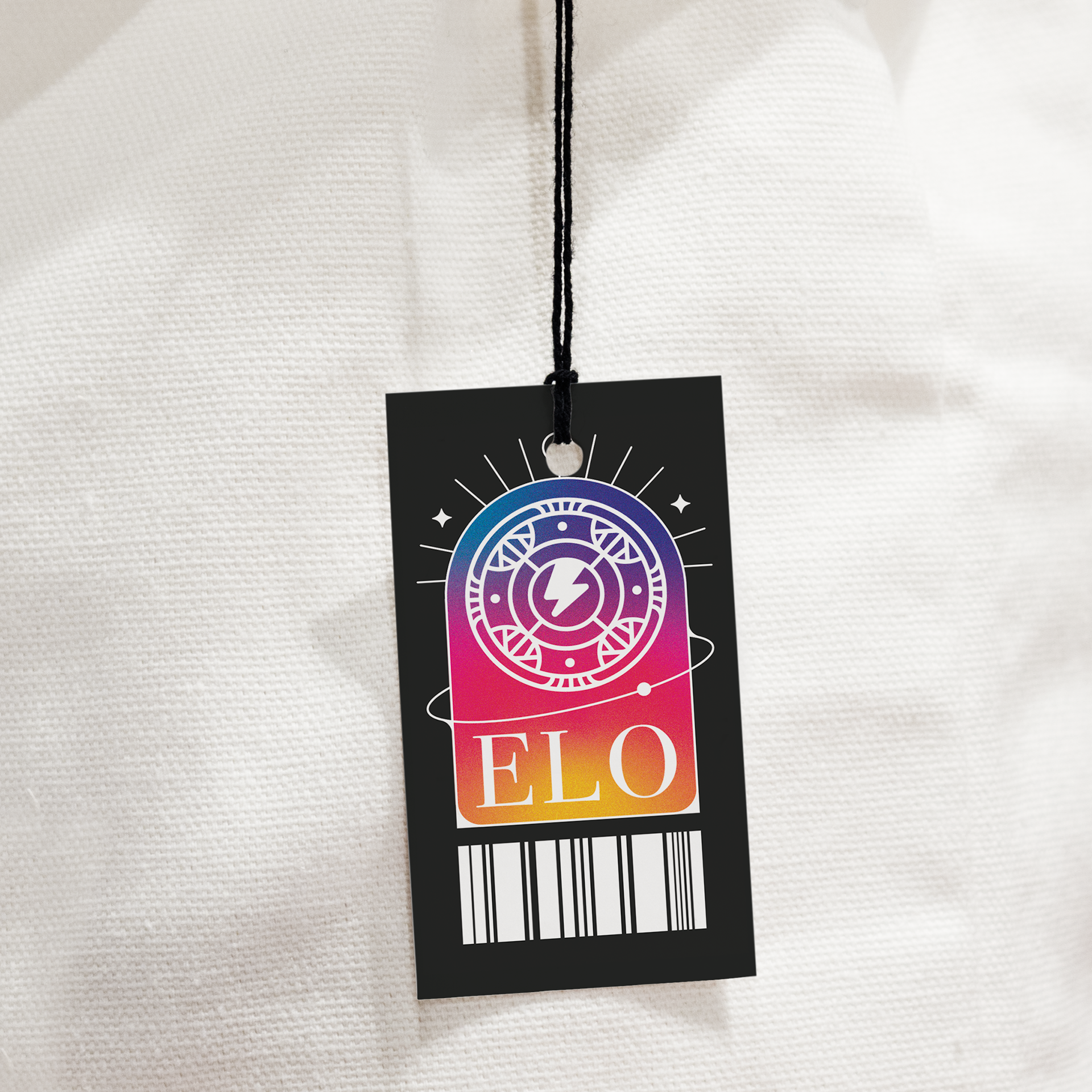
Create deliverables in the form of merchandise.
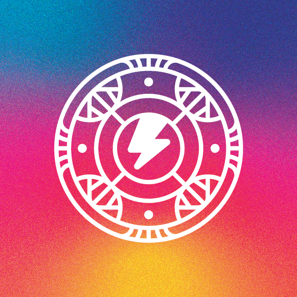
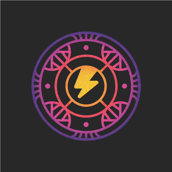
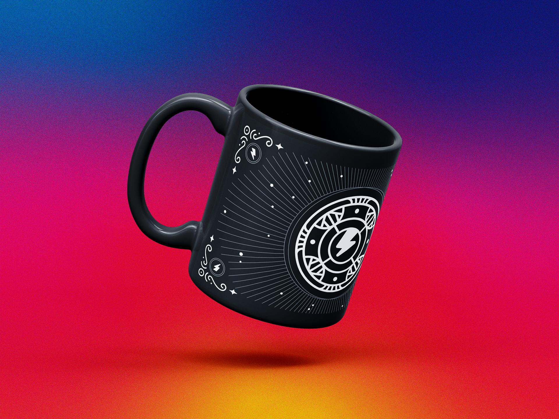
This rebrand is characterized by a combination of classical, vapor-wave, and outer space themes, based on ELO’s official branding and their iconic use of classical, synth, and rock music. Space is a common setting for their songs, album art, and even their UFO logo. “Out of this world” and similar phrases are often used by the band to promote their work. “Twilight” is another common term they utilize in mostly their songs. The color palette is based on their original primary color palette combined with the purples and pinks you would find in the sky at twilight. The noise texture is inspired by the airbrushed paintings that make up most of ELO’s official album art.