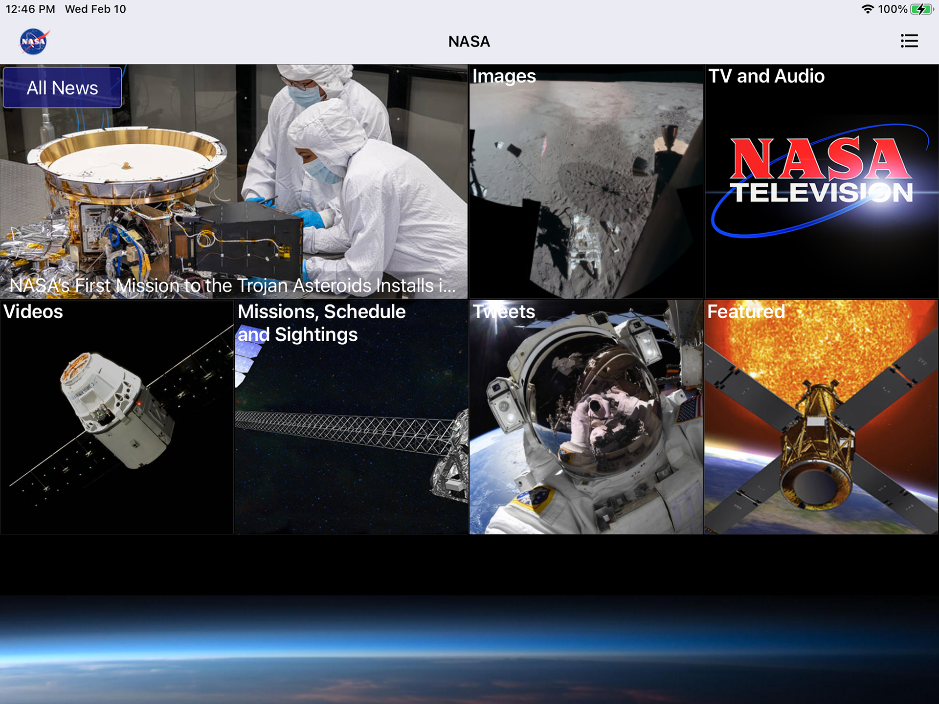
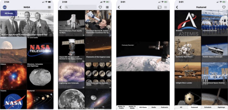
This project is a redesign of the official NASA app using Figma. The function of this app is to act as a hub for all things NASA such as viewing satellite photos, models of solar systems, latest news, missions, and videos. This app has a very basic layout that feels very outdated. The front page is just navigation, being taken up by tiles that take you to different sections of the app. Focusing on the news aspect, the news section is just one massive list of news stories that are seemingly not organized at all except by recency. There’s no way to sort them except by typing key words in the search bar at the top. The models section, while a little more fleshed out, is still outdated in terms of its functions and appearance. The only way to navigate between any of the different sections of the app is to go back to the home page. You can’t, for instance, open up the images and then navigate directly to news.
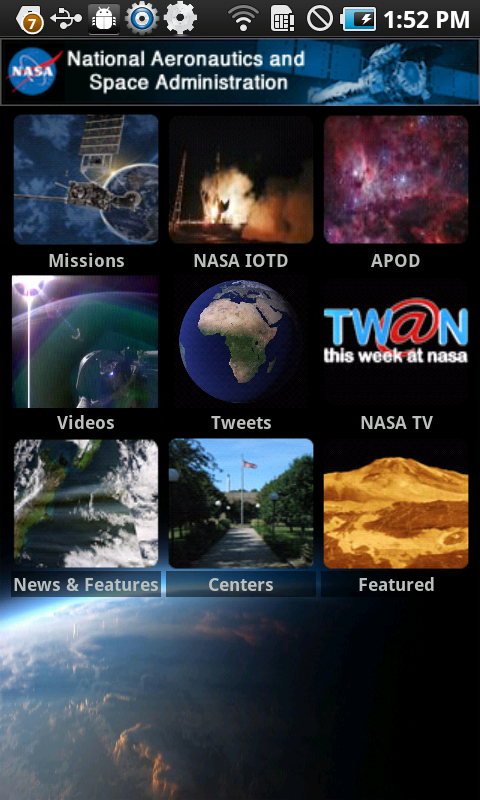
OLD APP
NEW APP DEMO
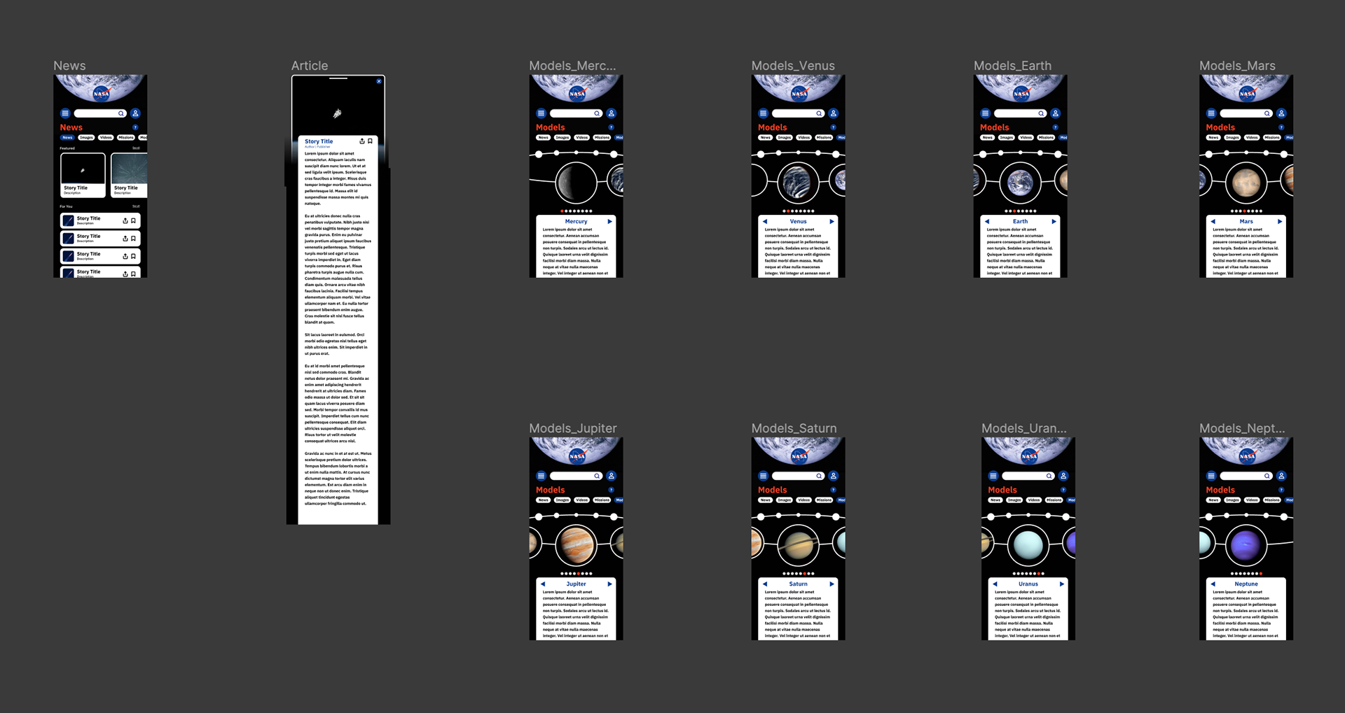
My redesign of the NASA app overhauls the user interface while keeping the key pages and functions. The original app's main page was comprised of tiles acting as navigation to other sections. I condensed the navigation into a side-scrolling row of buttons that is always accessible at the top of every page. The two sections that I have currently built out are the News and Models sections. The News section is first in the navigation bar since this app is primarily a way to funnel the news down to all things NASA. Additional sections act as ways to interact with NASA's findings and to educate. The News section features the usual saving and sharing functions as well as a featured section for the hottest NASA news.
The Models section is an educational model of our solar system's eight planets. I'll be adding more to this section such as the Sun, the moons of each planet, and ways to access information on them. This page is able seamlessly scroll between each planet, complete with animations to make the model appear three-dimensional. There are multiple ways to interact with the model including swiping from the middle, swiping from the sides, tapping on the corresponding dots below, and tapping on the left and right arrows. This is meant to ensure that the user always has a way to understand how to navigate the model, no matter their experience with mobile devices.